Orbit Interiors: A Visual Identity Built to Make Spaces Come Alive
From brand strategy to a visual identity built to make spaces come alive.
Understanding the Challenge
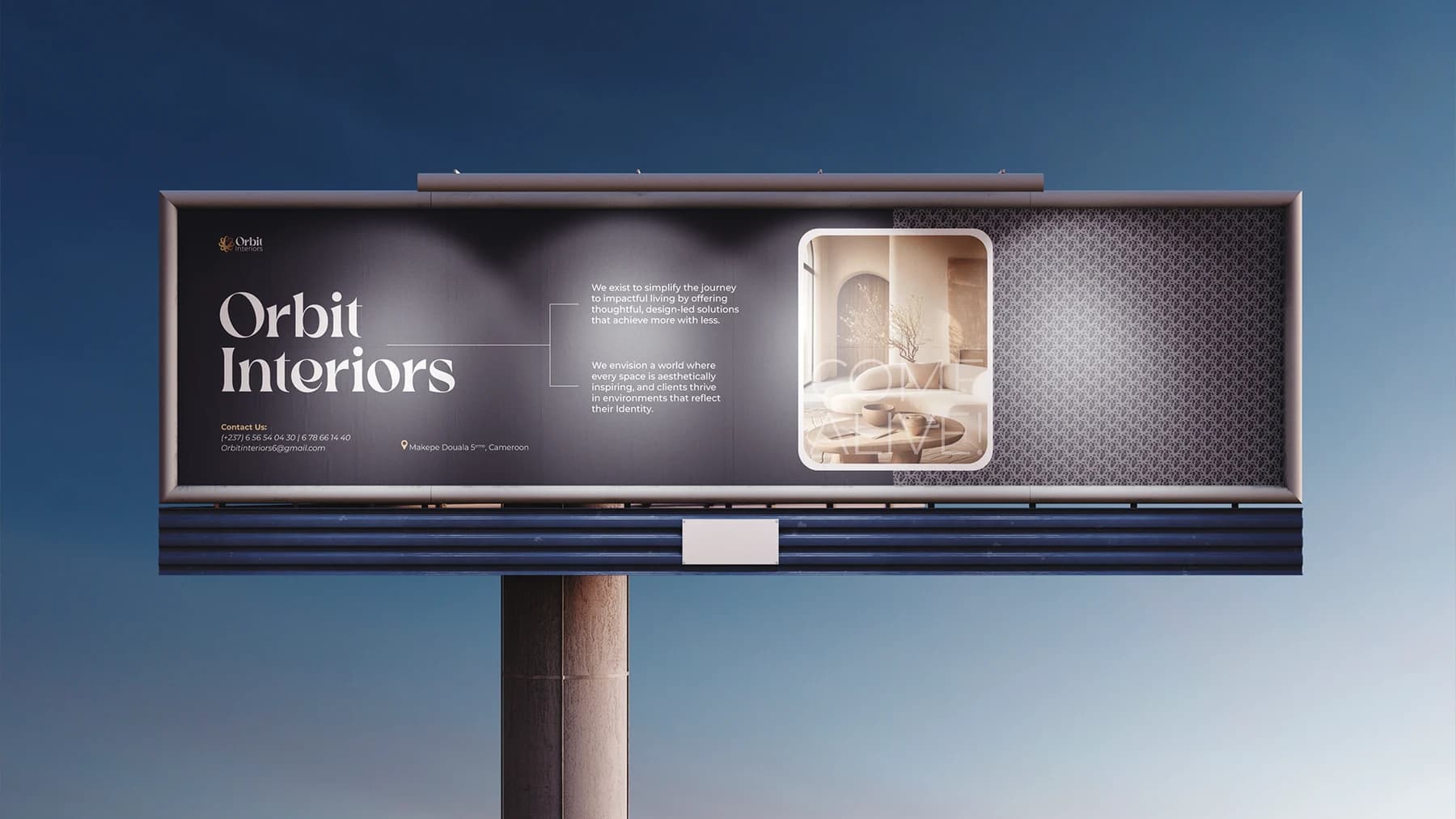
Orbit Interiors wanted to establish itself as a contemporary interior design brand in Cameroon, combining local craftsmanship with modern aesthetics. The challenge was to create a brand that felt premium, confident, contemporary, and personal — while clearly differentiating it in a market where interior design is often undervalued.
Building the Strategic Foundation
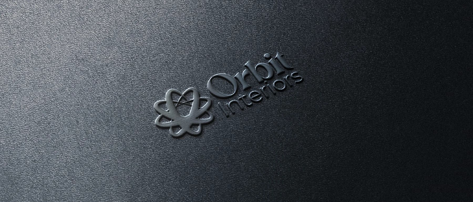
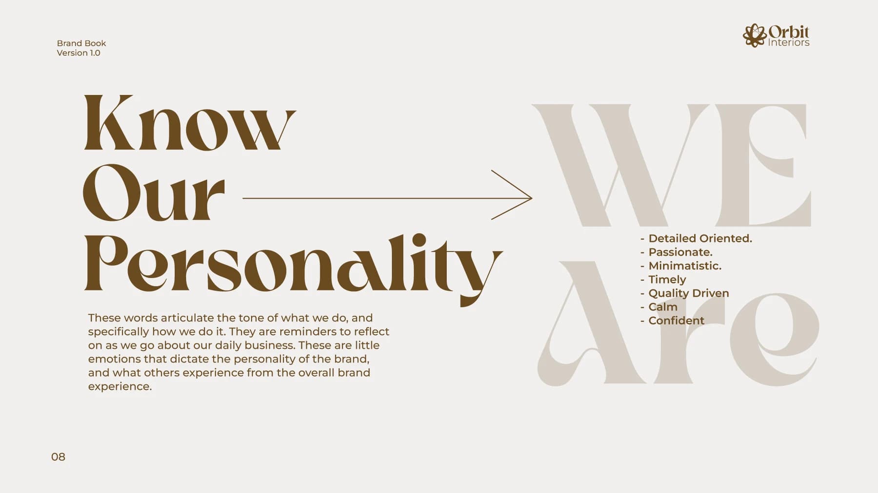
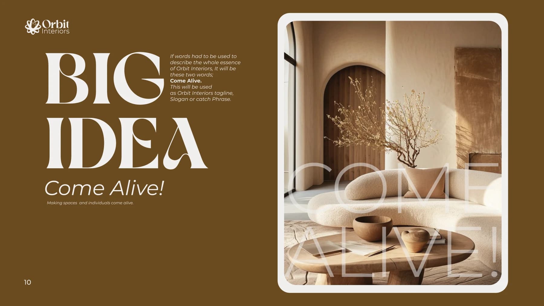
I began by defining the brand's purpose, audience, positioning, personality, and creative direction. The strategy centered on creating personalized, functional spaces that reflect the identity of the people who inhabit them. This led to the brand's central idea: COME ALIVE — making spaces and individuals come alive.
Designing the Solution
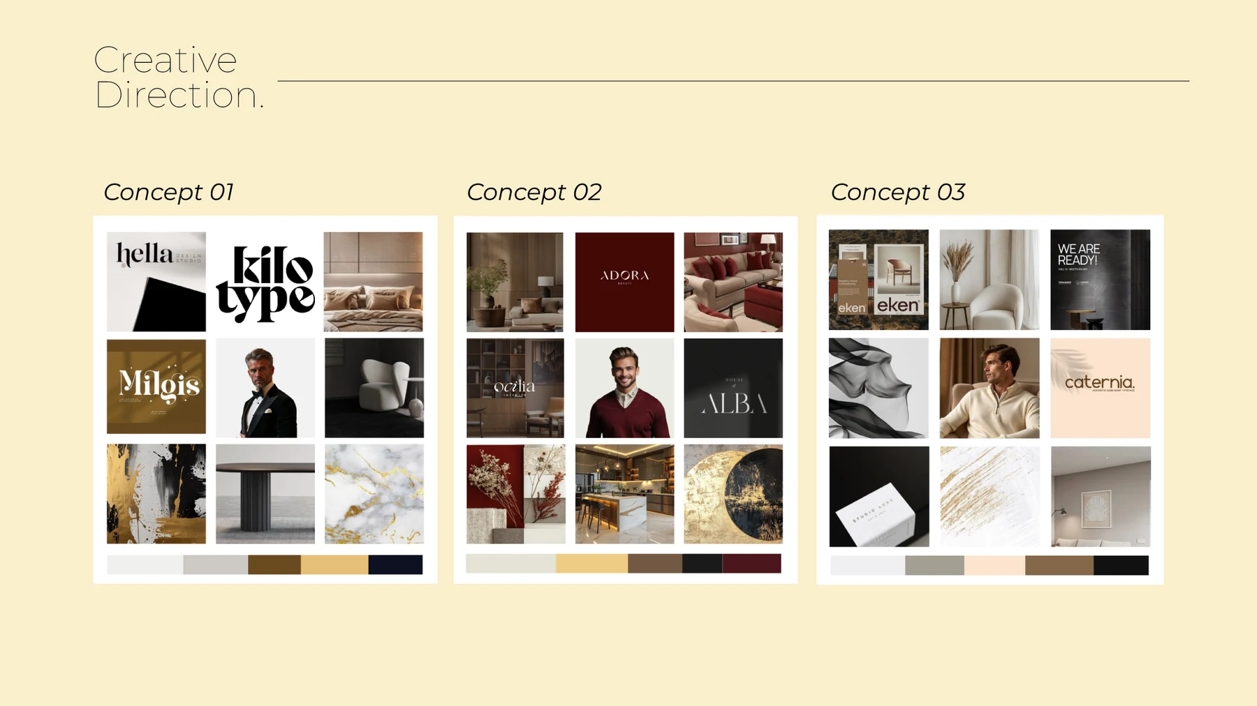
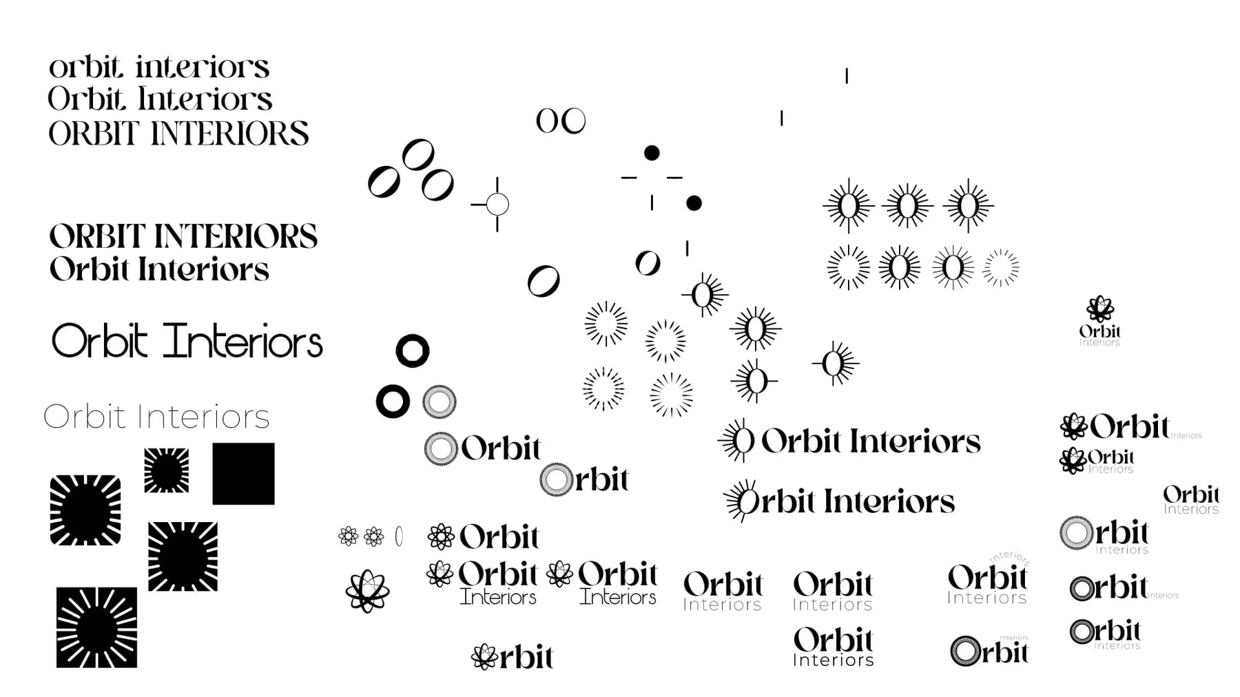
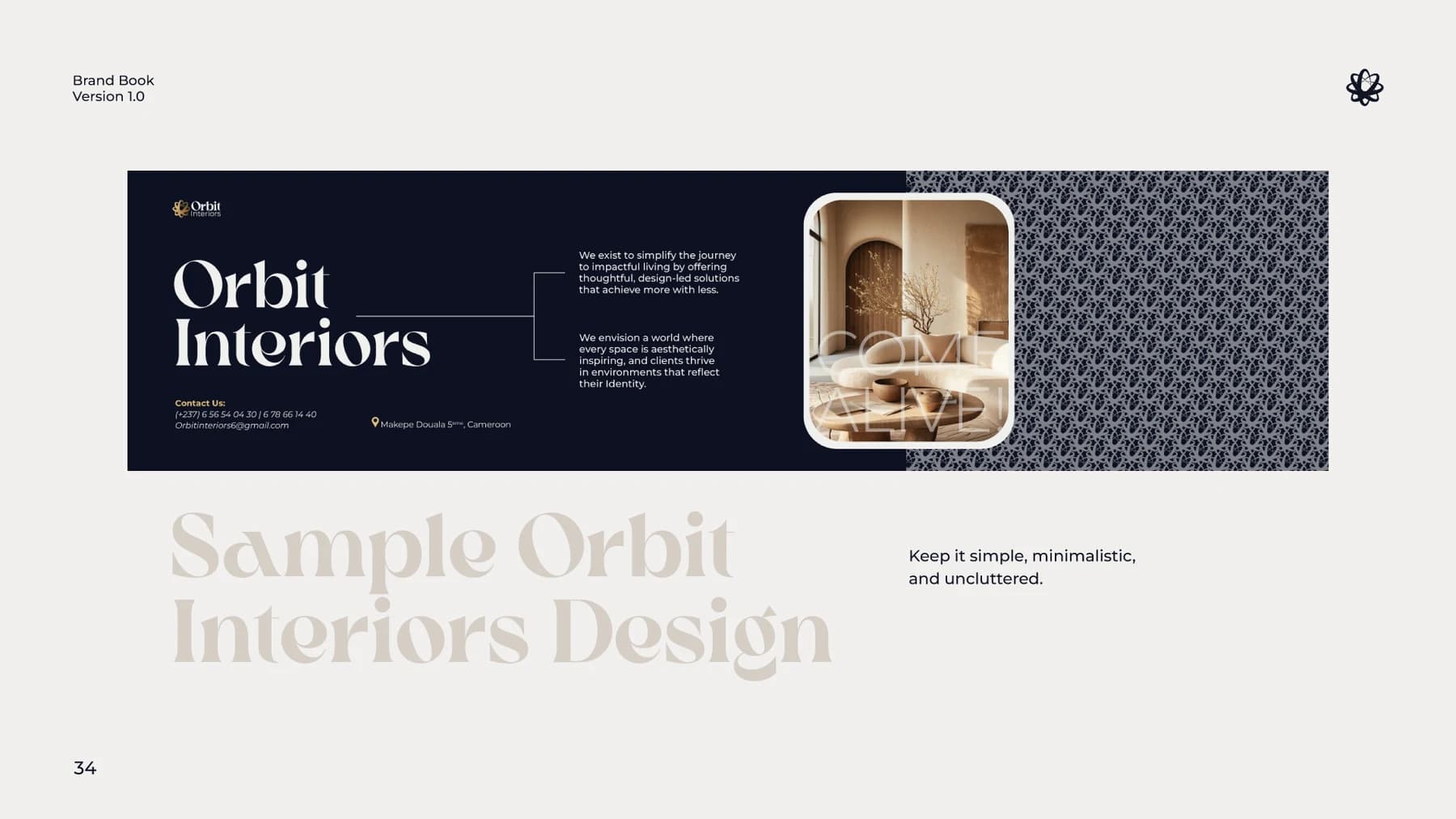
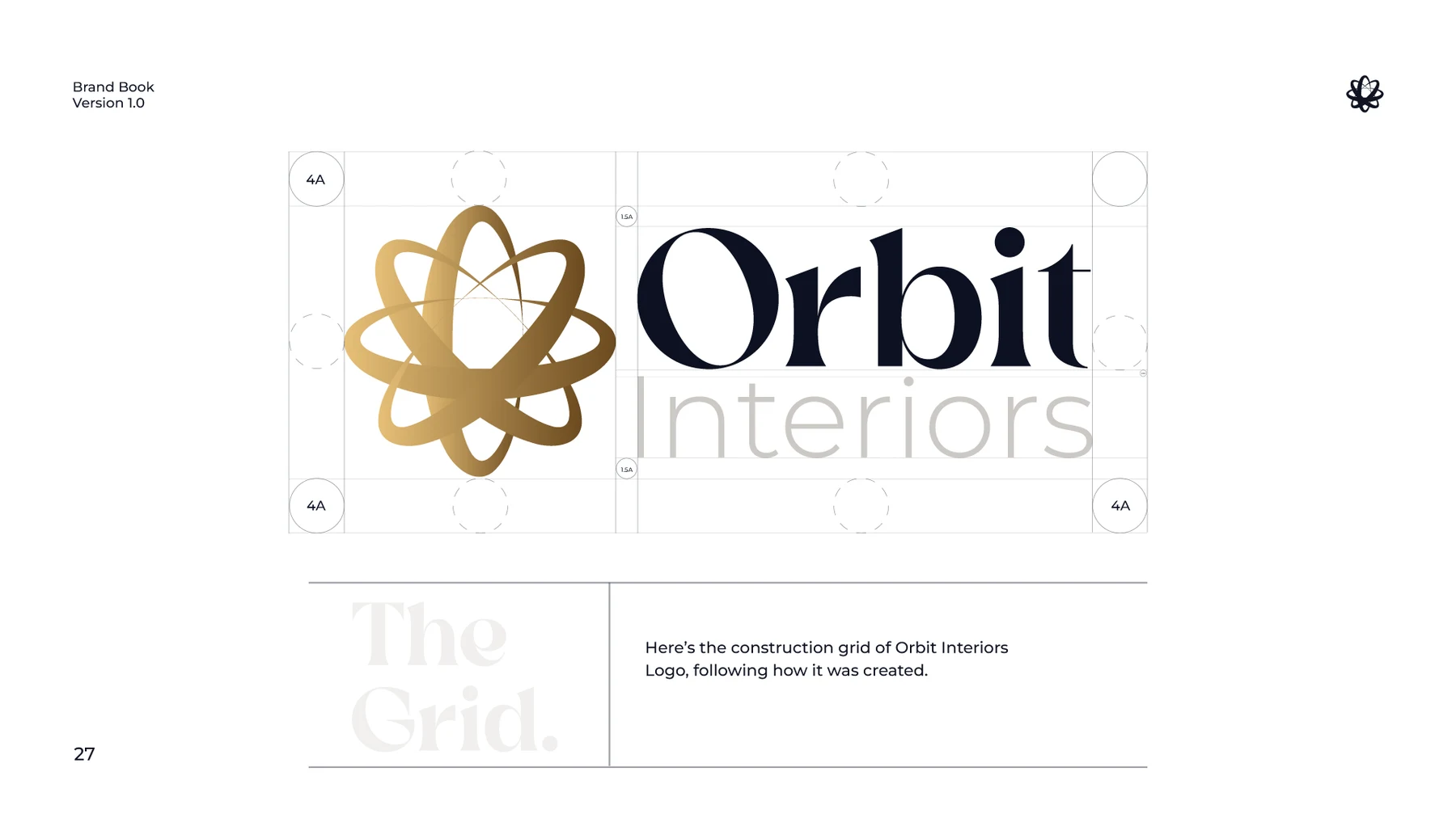
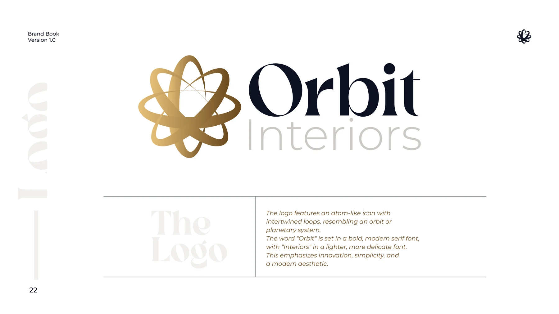
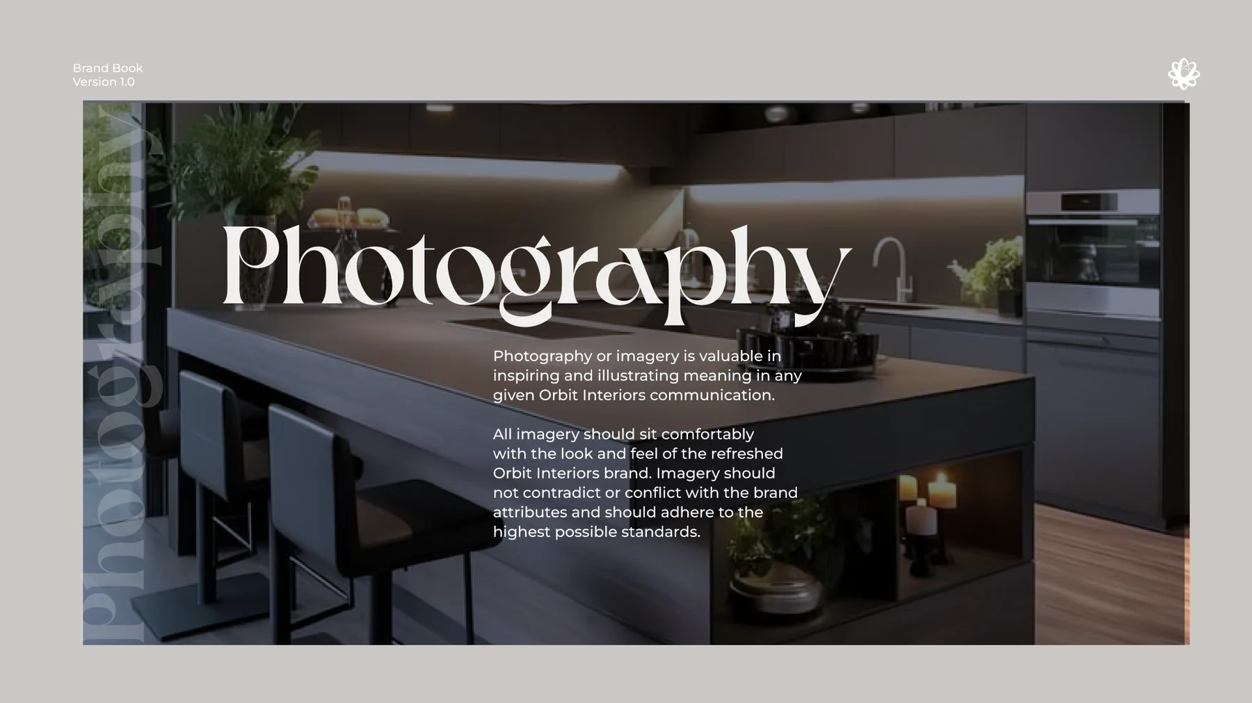
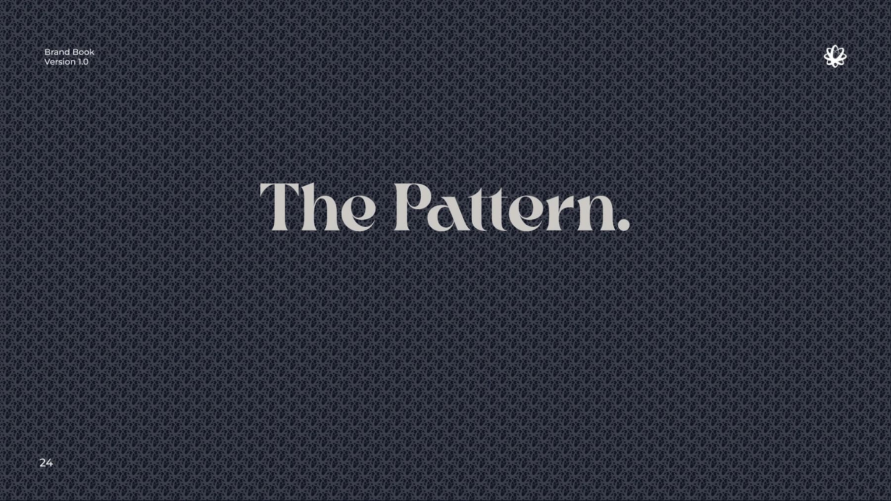
The strategy translated into a complete visual identity system. The logo uses an orbit-inspired symbol to communicate movement, space, innovation, and connection. The visual system combines deep, sophisticated tones with warm brown and subtle gold accents; elegant typography (Crake Test and Montserrat); minimal layouts that create a calm, premium experience; and intentional imagery that showcases the spaces and craftsmanship behind the brand.
Building the Brand System
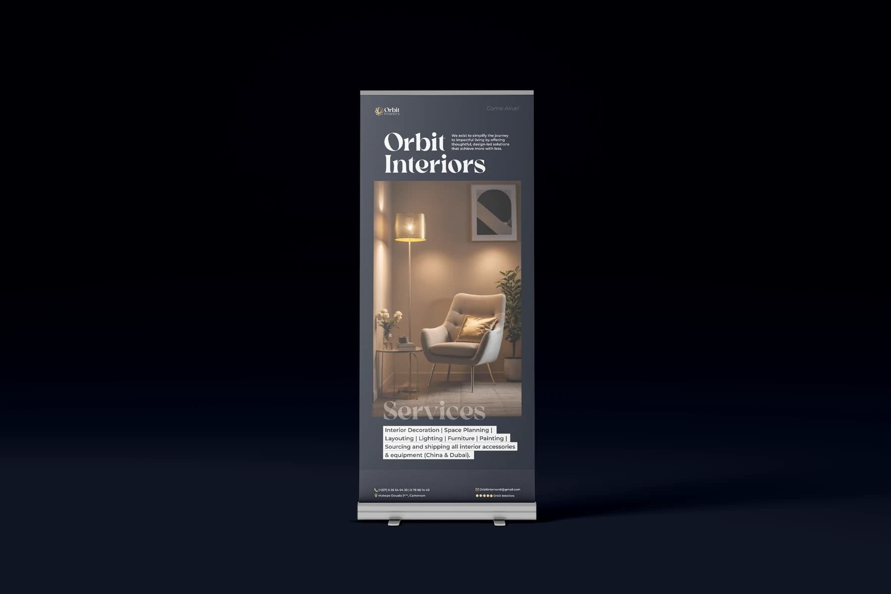
Beyond the logo, the identity became a full brand system and guidelines — covering logo, color, typography, pattern, photography, and applications — then rolled out across stationery, apparel, signage, outdoor advertising, and other brand touchpoints.
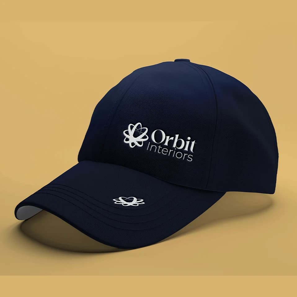
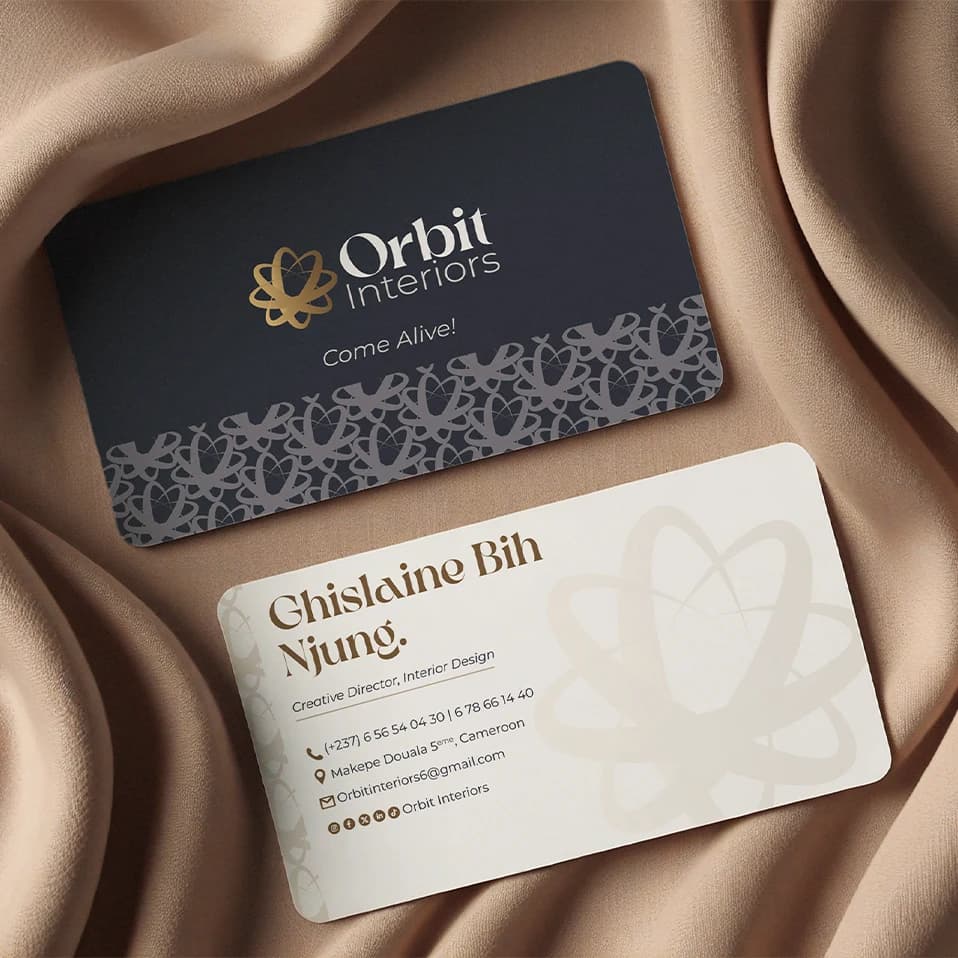
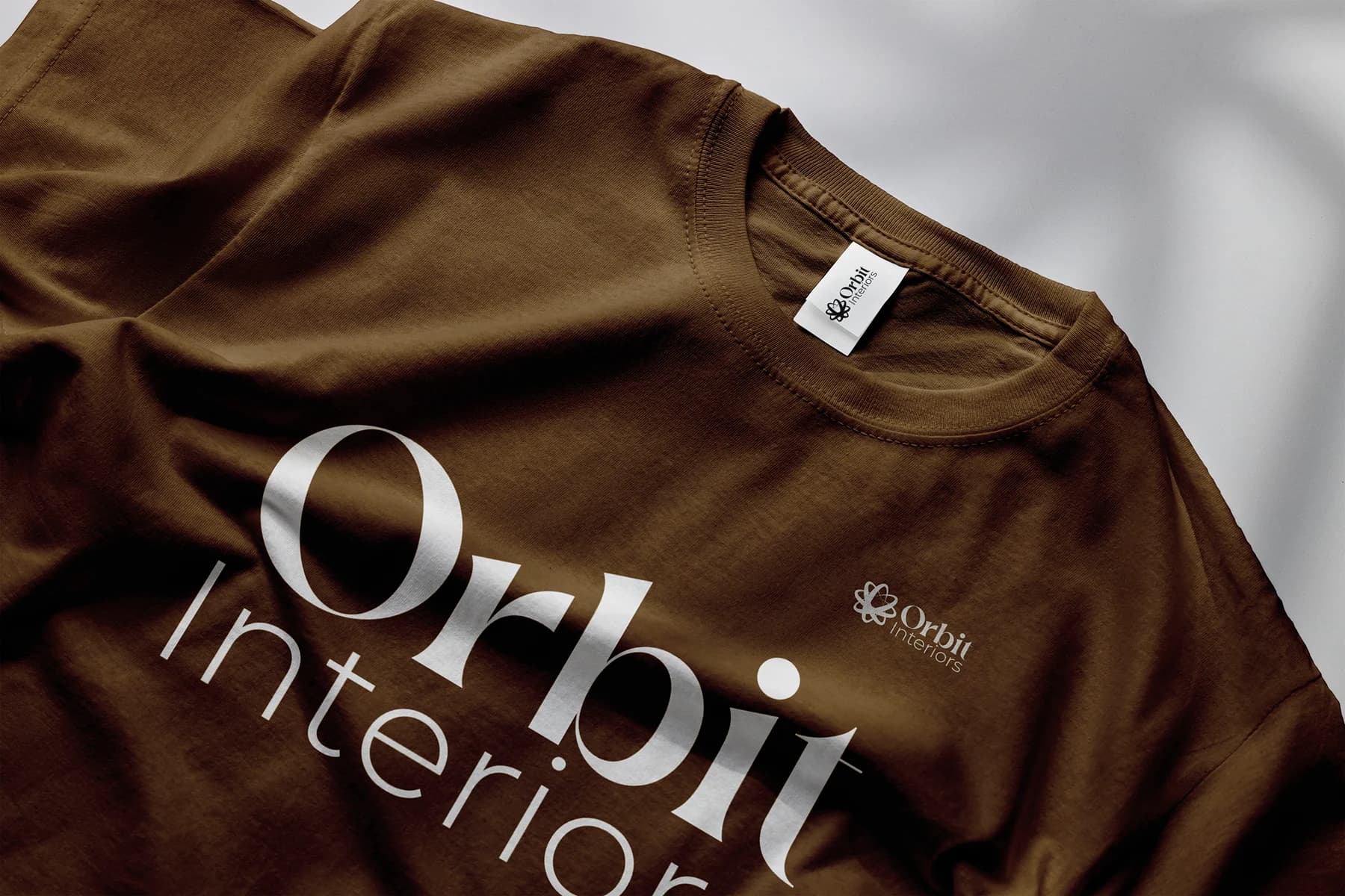
COME ALIVE. Making spaces and individuals come alive.
Related Projects

Let's Build
Have an idea worth building?
Whether you're developing a brand, solving a communication problem, or exploring an idea that needs structure, I'd love to hear about it.
Start a Conversation →